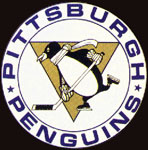
1967-68 season : The team's first logo, with a hockey-player type of
penguin (wearing a scarf !) over an upside down triangle which represents
the Golden Triangle in Downtown 'Burgh. All this surrounded by a white
circle with the name "Pittsburgh Penguins" over it.
1968-69 season : For the tema's second season, some changes were made,
with the Penguins having its scarf removed. Also the circle around the logo
now is blue with white letters. And the penguins itself is a little more
refined.
1971-72 season : Some changes for 1971 season, as the circle is removed.
This logo would live for 2 decades, enough time to see the only 2 Stanley
Cups the tam has.
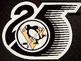
1991-92 season : To celebrate the team 25th anniversary, the Penguins
utilize their logo on a special patch
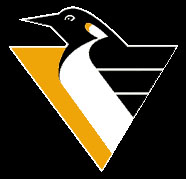
1992-93 season : The new ownership decided for changing the logo after the
second cup (one year after this ownership took control), which now is a more
stylish and modern Penguin (no longer a player), yet the gold and black
colors are preserved, as well as the representation of the Golden Triangle.
Check out how the logo changed over the years in this table :